3+ mvcd POSTER DESIGN
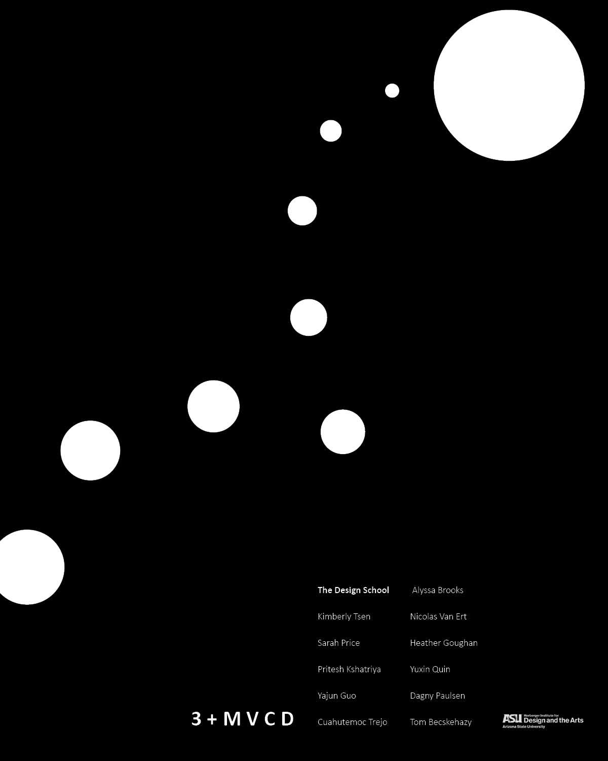
This poster was a long process to create. The goal was to make a poster to advertise the 3+ MVCD students' final review, using their names, the program name, and the school logo. The dot design for the poster came from a simple exercise with points, lines, and planes - aka design staples. A few months after I finished the black and white version of this poster, I was able to return to it and apply some of what I had learned about color theory to it. After starting with a super bold rainbow (that reminded me of Pride!), I decided that a more muted pastel was the better choice for the theme of this poster. Sometimes color can change the whole vibe of a design!
ADOBE INDESIGN